Skip to content

There are no more instant pay-outs in search engine optimisation. Google now puts more and more emphasis on the expertise of site content when it comes to organising search results. For a long time already, Google’s algorithm has focused on detecting the writers behind site texts, their level of expertise and the reliability of content.

Anyone maintaining a website would like to find a way for having their site at the top of Google’s search results. Good search engine optimisation (SEO) plays an increasingly important role in how well customers find the service. For years, the experts of SEO have known the tricks of including the selected keywords into website titles, body texts, metadata and content highlights. However, Google is always one step ahead of us optimisers – we can no longer get by using only the old tricks.

For a long time now, Google has been adjusting its algorithms to better detect the quality and expertise of site content. Who are the writers of site content and what is their level of expertise? How reliable can the content be considered? And does the website’s brand have credibility? Faceless, bulk-manufactured content is becoming increasingly unworthy in Google’s eyes.

E-A-T: Expertise, authoritativeness and trustworthiness

A combination of three letters is now at the core of SEO: E-A-T. The letter combination is an abbreviation for expertise, authoritativeness and trustworthiness. Google’s algorithm uses these factors, among others, to assess whether your site has something to offer for the people browsing sites.

This means that if, for example, a private health clinic purchases produced content for its website that is not marked as text written by any particular expert, it may be suspicious to Google from the point of view of expertise. On the other hand, if a healthcare specialist is marked as the writer of the text, the site is placed higher in search results. Google also interprets the content of LinkedIn pages and profiles and rates experts. That is why it is recommended to link the site texts to the author’s profile on LinkedIn.

Google also recognises brand mentions from elsewhere on the internet. This affects the reputation of the brand and its website in Google’s eyes. If a brand is often mentioned or linked to, for example, on other expert websites or in reputable online magazines, it also increases the brand’s authoritativeness with Google. Creating a Wikipedia page for your own brand can also help to increase authoritativeness.

What is trustworthiness in Google’s eyes?

Trustworthiness on the internet is a vague concept. For Google, however, trustworthiness is more or less equivalent with good brand reputation. Trustworthiness is affected by, for example, how quickly the site responds to customers’ questions, how customers are treated and how complaints are handled. The ability to comment or contact the company can increase trustworthiness in Google’s eyes. Trustworthiness is also affected by customer reviews on social media.

For Google, trustworthiness also means transparency and accuracy of information. So be sure to add references to the site information and link it to the source. Make sure to add contact details on the site, both on the contact page and in the footer. You should also include a privacy statement. If your brand has an online store, information about deliveries and returns should be clearly displayed on the site.

The older the site is, the more trustworthy Google considers it. Google values old domains, so you should always think carefully about creating a new domain.

Voice searches are increasing fast

Google’s algorithm is a carefully guarded secret, the changes to which the company never discloses. There are usually rumours of changes on the internet as the optimisers try to keep up with the search engine giant. E-A-T is believed to be emphasised because of Google’s efforts to only provide accurate information and weed out fake news and misinformation from its search results. It is also speculated that Google appreciates responsibility, especially corporate responsibility, increasingly more these days.

The Google Lens image search app has also made key photos increasingly important. Google Lens is an artificial intelligence that recognises things like objects and animals that appear in the camera preview and images in the Google Photos app and searches for them online. A key image is a clear and well search engine optimised internet image of a company’s product, for example. Lens can help you quickly learn more about the objects in the photo.

The importance of voice searches is also heavily increasing as devices obeying voice commands are becoming more common. The most optimistic people predict that as many as half of the searches performed this year will be voice searches. This affects findability and makes longer search terms, i.e. entire search queries, better suited for voice searches. So there are fewer and fewer shortcuts to the best rankings in search engines. SEO is increasingly more about long-term work with quality of content at the heart of everything. SEO must meet the user’s needs in the best possible way and, above all, offer expert, authoritative and trustworthy results. You don’t have to know how to do everything yourself – an understanding partner is often a valuable asset.

TAKEDA — Campaign

How does ADHD feel like?

Miltä ADHD tuntuu? (How does ADHD feel like?) is an innovative communications campaign about adult ADHD, its recognisability and awareness. The multi-channel campaign took health informing to a new era with the help of gamification and experience experts. A video to support the campaign reached 161,000 total views on YouTube and directed the audience to search for more information.


Adult ADHD at the heart of the campaign

Finns are nowadays familiar with childhood ADHD and the symptoms are well recognized. ADHD in adults is quite common at the population level. Adult ADHD, however, may be initially interpreted as another disease, such as depression or anxiety. In addition, the symptoms of the symptomatic patient are not always taken seriously. Adult ADHD should be discussed more, the disease should be diagnosed faster and symptomatic persons should be encouraged towards treatment at a lower threshold.

Takeda wanted to reform health informing and put experienced and peer experts at the heart of the campaign instead of the traditional authority-driven informing. The FULL ADHD – Täyttä elämää mobile game, developed by Psyon Games, was created in collaboration with an expert psychiatrist, the Finnish Association for ADHD and experiential operators in order to raise awareness.


The multi-channel campaign was noticed

The campaign’s central communications tool was a 90-second video providing insights into the inner world of an ADHD person and inviting people to download the game. The video increased people’s understanding and knowledge of the impact of ADHD on the functioning of an individual. It concretized the chaotic situations of the everyday life of a person suffering from ADHD and explained the means to cope in those situations. The situations were peer-reviewed by experiential operators of the Finnish Association for ADHD. Different versions of the video were created for different digital channels.

For the campaign, radio adverts were created for national radio channels to be aired for three weeks. Both the radio adverts and the videos directed people to download the mobile game. The campaign was also supported by digital advertising.

A visual look was designed for the campaign that combined the game’s graphic world and a creative perception of the range of emotions experienced by persons with ADHD. The visual look was reflected in the video, on the campaign site, on the campaign’s social media accounts and in the promotional materials.

The communicative health informing was supported by the campaign’s content marketing article and media communications.

https://www.youtube.com/watch?v=j2x9Pealku0

The campaign has clearly increased the awareness and recognition of ADHD symptoms in adults. We have received praise from the experiential ADHD operators, the Finnish Association for ADHD and healthcare professionals for providing modern, digital and experiential health information. The campaign provides a multi-sensory opportunity to experience what ADHD can feel like. From our point of view, this is unique compared to other health informing campaigns”.”

Laura Aulanko, Business Unit Director, Takeda

161 000

video views on YouTube

1.

The Pharmaceutical Information Act
of the Year

6702

ADHD-related article reads

Katri Pelli
Accont Director
+358 40 830 5372

Read Next

  • Campaign — 
  • Communications

Paula teaching friendship skills to first graders

  • Campaign — 
  • Communications

Erottaja2 – From an unknown building to a popular attraction

1. Controller
Drum Communications Inc
Tehtaankatu 27–29 D
FI-00150 Helsinki, Finland
Business ID 3316484-5

2. Contact person responsible for the Register
Tiina Vasama
tiina.vasama@drum.fi

3. Register name
Communications and Cooperation Partner Register of Drum Communications Inc

4. Legal basis and purpose of the processing of personal data
We process personal data in order to fulfil the contract for the service that our client has ordered.

The purpose of the processing of personal data is to transmit notices, invitations or other information
on behalf of our clients.

Data shall not be used for automated decision-making or profiling.

5. Data content of the Register
The following information necessary for the purpose of the Register may be processed:

Person’s name
Company/organisation/blog name
Contact information (address, telephone number, email address)
Website address
Usernames/profiles in social media services
Information related to cooperation (e.g. what product samples/test equipment were sent)
Information about participation in events
Data shall be retained for as long as is necessary for the purposes of cooperation.

6. Regular data sources
The sources of information are the information provided by the client of the Controller, the information provided by cooperation partners
and publicly available sources of information.

7. Regular disclosure and transfer of data outside the EU or the EEA
As a rule, data shall not be disclosed to third parties. Data can be disclosed to
Drum’s subcontractors when they participate in the activities described in this privacy statement
related to the implementation of the use purposes. As a rule, information shall not be disclosed to parties outside of the EU or the EEA.

8. Principles of protecting the Register
The Register shall be handled with due care and the data processed with the help of information systems
shall be appropriately protected. When Registered data is stored on internet servers, the physical and digital data security of the used equipment shall be ensured in the appropriate manner. The Controller shall ensure that the stored data, access rights to servers and other information critical to the safety of personal data is processed confidentially and only by the employees who must process such data as a part of their job description.

9. Right of inspection and right to request rectification of data
Any person in the Register shall have the right to verify their data recorded in the register and
to request the rectification of any inaccurate information or the completion of incomplete information. If
the person wishes to check or rectify the data recorded about them, the request must be sent
by email to the Controller. The Controller may, if necessary, request the person submitting the request to
prove their identity. The Controller shall reply to the person submitting the request
within the time limit laid down in the Data Protection Regulation of the EU (normally within one month).

10. Other rights related to the processing of personal data
Any person in the Register shall have the right to request the erasure of their personal data
from the Register (“right to be forgotten”). Data subjects also have other rights
under the General Data Protection Regulation of the EU, such as
the limitation of the processing of personal data in certain situations. The requests must be sent to the Controller by email. The Controller may, if necessary, request the person submitting the request to prove their identity. The Controller shall reply to the person submitting the request within the time limit laid down in the Data Protection Regulation of the EU
(normally within one month).

Website cookies

The website uses cookies, which help to ensure the technical functionality of the website, improve the user experience and collect visitor statistics. The purpose of visitor monitoring is to develop the quality and content of the website in a user-oriented manner. The user data is not used for marketing or transferred outside of Drum.

A cookie is a small text file that is sent to and stored on the user’s computer. Cookies do not damage the users’ computers or files. The website uses both session-specific and tracking cookies. Session-specific cookies are stored in the memory while the browser is open. Only tracking cookies used to identify new visitors and returnees will remain.

We ask for your consent to the use of cookies the first time you visit the drum.fi website.

SUOMEN TILINTARKASTAJAT RY — Campaign

“I’m an Auditor” – A hot campaign raised awareness of the auditing industry among young people

Is there anything hotter in the world than an auditor? Well no! Drum designed a delicious campaign concept for Suomen Tilintarkastajat (Association of Finnish Accountants) to break the myth of a grey and boring industry. The bold campaign sparked the interest of young people both on social media and at events.


Grey and boring auditor?

The results of the survey commissioned by Suomen Tilintarkastajat Ry were clear: young people found the profession boring and the work a lonely slog. However, this perception does not reflect reality. The work of an auditor is varied and flexible, employment prospects are good and the pay is right on target. Together we set out to break down these misconceptions. The aim was to make the profession more attractive to young people and at the same time to create professional pride among auditors.


Let’s make auditors the bombshells of the dating market

What if we combined two important themes in young adult life: the pursuit of love and the excitement of a fresh career? We created a campaign concept where the accountant is suddenly the hottest stuff on the dating market.

The campaign concept shows two people dating. One is excited about an interesting and eventful day at work. The date is excited: what is this profession where the days are so versatile, exciting and the work community seems wonderful?

Well, an auditor of course!


https://vimeo.com/1037807258/af6e9c2c8c?ts=0&share=copy

Delicious content took over the web, cinemas and events

With delicious visuals and striking campaign materials, the campaign took a big step away from the grey image associated with auditors.

The multi-channel campaign was displayed on young people’s preferred social media channels (Instagram, TikTok, Youtube and Jodel, Finnish chatroom app), as well as in Finnkino cinemas and on Tinder. During the campaign, a commercial partnership was established with the Finanssiveli meme account. In addition, the campaign was presented at student events organised by Suomen Tilintarkastajat and at the Studia fair stand. The campaign was an effort by the whole industry and the materials were also widely distributed through the audit communities’ own channels.

The campaign included:

  • Two campaign videos, animations, photos and social media posts
  • Campaign page and career stories
  • Materials for student events: quiz, student overall patches, posters, brochures, and props for photo shoots

Bold campaign caught the attention of the target group

The campaign had three launches: one each in November 2024, January and March 2025. The three launches reinforced the campaign’s impression on the target group and also coincided with the application periods for university majors and joint application system.

Already in its first launch, the campaign reached its target audience well and generated enthusiasm both among young and existing auditors. The bold and distinctive look of the campaign received plenty of praise, and the campaign content appealed to the public.

The best performing Jodel spot had a click-through rate of 3.81%, compared to a typical 0.3%. On YouTube, almost 75% watched more than half of the campaign video. The overall patches were a big hit at the events. The campaign also attracted many new followers to the channels of Suomen Tilintarkastajat.

3.7 million

impressions on social media

26 000

clicks on the campaign page

Over 7 000

likes on the Finanssiveli’s post


https://vimeo.com/1037825834/29f8a16aac?ts=0&share=copy


Drum’s execution speaks insightfully to the target audience and also manages to make those already in the industry proud of their own versatile profession. The planning, budgeting and channel choices seem to have been spot on. It’s great to continue working together from here on.”

Jaana Lindman, Head of Communications and Advocacy, Suomen Tilintarkastajat ry


Noora Happonen
Communications Consultant
+358 40 829 1788

Read next

  • Campaign — 
  • Communications

How does ADHD feel like?

  • Campaign — 
  • Communications

Erottaja2 – From an unknown building to a popular attraction

DR OETKER — Campaign

Paula teaching friendship skills to first graders

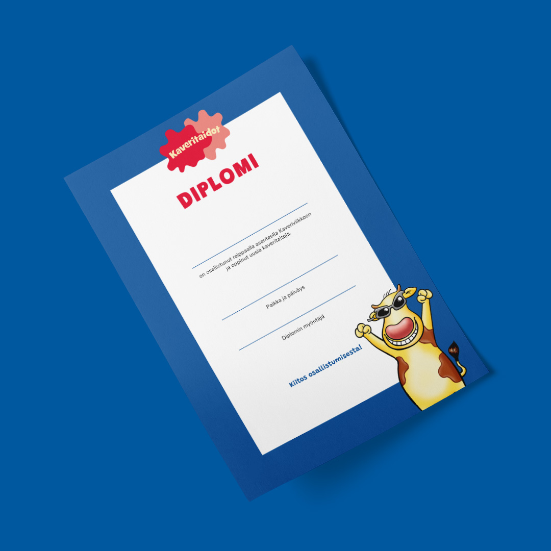
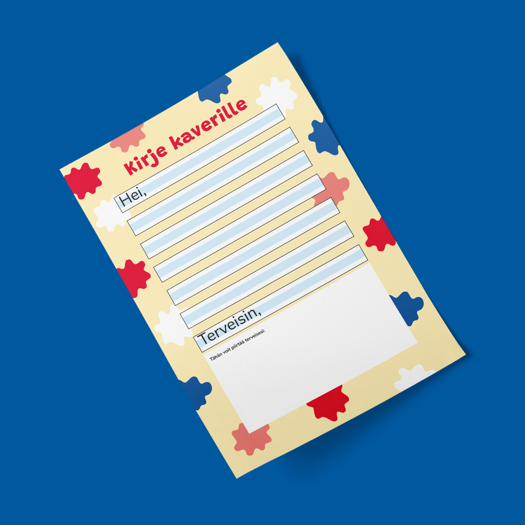
Friendship skills are social skills that need to be practiced from a young age. The younger you start to practice, the better you become at dealing with social situations. Now these important skills are taught to first and second grade students by Dr. Oetker’s Paula puddings in cooperation with SOS Children’s Villages.


Practicing friendhip skills from the first grade

No child should be left alone because he or she does not have sufficient skills to establish friendships. This goal led SOS Children’s Villages Finland and Paula puddings to carry out a campaign in order to teach friendship skills to first graders. First graders and their teachers were chosen as the target group because good friendship skills help to build friendships throughout life.


Partnering with SOS Children’s Villages Finland

SOS Children’s Villages Finland is the partner of the PAULA Kaveritaidot (Friendship skills) campaign. The need for teaching friendship skills was also noticed by SOS Children’s Villages. In May 2020, when the coronavirus hit Finland, SOS Children’s Villages Finland established the Apuu chat to ensure that no child would be left alone with their worries and fears.

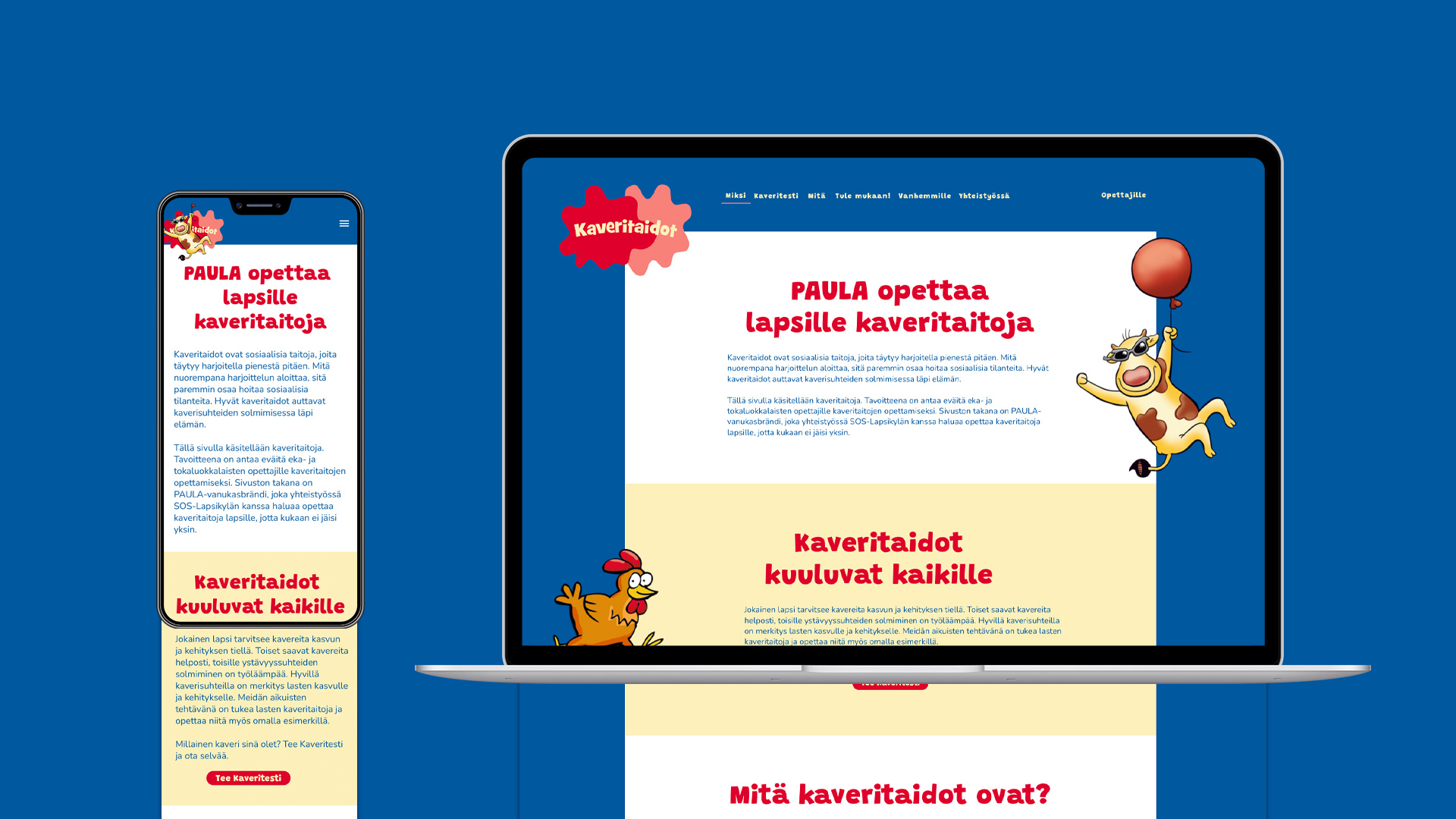
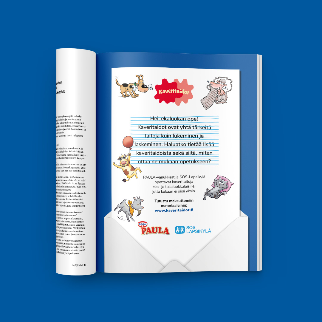
At the same time, a dedicated website for friendship skills, Kaveritaidot.fi, was launched with the purpose of providing tips for the teachers of first graders for teaching friendship skills. Friendship skills were also promoted by means of radio advertising, in an HS article, in newspaper advertisements as well as social media content and influencer communications. A friendship skills test was also spread in social media.


Few of us can cope here alone, so we need each other. Friendship skills are needed for group working and maintaining friendships. Good friendships are also important for children’s growth and development.”

Elina Stenvall, planner, SOS Children’s Villages Finland

Simo Arvo
CEO
+358 40 132 5682

Read next

  • Campaign — 
  • Communications

How does ADHD feel like?

  • Campaign — 
  • Communications

Tasty coffee at the Nespresso Secret Garden event

WELLBEING SERVICES COUNTY OF VANTAA AND KERAVA – Communication

Hyvantekijät – Drum designed the employer image of the Wellbeing services county of Vantaa and Kerava

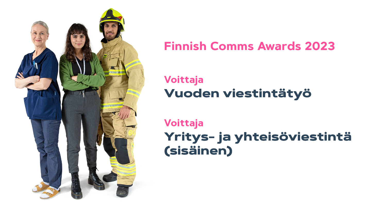
Drum designed an employer image for VAKE, the Vantaa and Kerava wellbeing county, which was established in 2023, with the aim of engaging existing employees in the new community and attracting new employees. The communication addressed a social sector struggling with a shortage of employees. The successful employer image won, among others, the award for Communications Work of the Year at the 2023 Finnish Comms Awards.


An employer image that supports employee retention and employer attractiveness

While good workers and workforce retention are vital, the sector of healthcare and social welfare is struggling with both retention and attractiveness. While good workers and workforce retention are vital, the sector of healthcare and social welfare is struggling with both retention and attractiveness. VAKE, in need of both existing and new recruits, wanted to put a large effort into employer image work, and in close collaboration with branding work, comprehensive employer image work was carried out before the organisation started its operations on 1st of January 2023.

In a changing situation, it was important to quickly build a strong employer image that would engage existing employees in the new community and attract new employees.

An employer image was created that reflects joy, enthusiasm and pride, drawing on values, meaningful work and the new organisation’s core mission. The aim was to show appreciation for the employees and their work.


We help, we treat, we rescue

The long and complicated name of the organisation and its original abbreviation, Vakehyva, were translated into a communicational asset. The vision was summarised as:
Good, better, the best.

This was done to underline the growth path towards becoming the best wellbeing services county in Finland.
The value proposition was summarised as:

We help, we treat, we rescue,

and it was decided to start talking about workers as do-gooders (hyvantekija).

These became the premise for the marketing communication concept of the Hyvantekijat, in which the experts in the sector of healthcare and social welfare are presented as heroes.


Hyvantekijat is easy to engage with

The materials and theme of Hyvantekijat have been utilised extensively in VAKE’s channels, events and recruitment marketing. The staff are happy to be part of the Hyvantekijät team and the hashtag has taken off.

VAKE’s brand has attracted the attention of jobseekers, both at events and in recruitment. The number of applicants doubled immediately after the launch and continued to increase. There has been a high volume of applications in a sector facing a huge workforce shortage.


Employer image comes to life in videos

The employer’s image was brought to life during the filming, where various images and video material were produced for versatile use in communication and marketing.

Longer and shorter versions of the videos were made for various purposes across different channels.

https://vimeo.com/862333087?share=copy


Mikko Koivulehto
Concept Planner, Partner
+358 40 555 1313

Read next

  • Brand

Drum designed a new, bold and fresh look for the Deaconess Foundation

  • Brand

Drum renewed the look of the Ministry of Agriculture and Forestry

MNISTRY OF AGRICULTURE AND FORESTRY — Brand

Drum renewed the look of the Ministry of Agriculture and Forestry

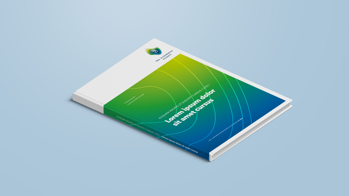
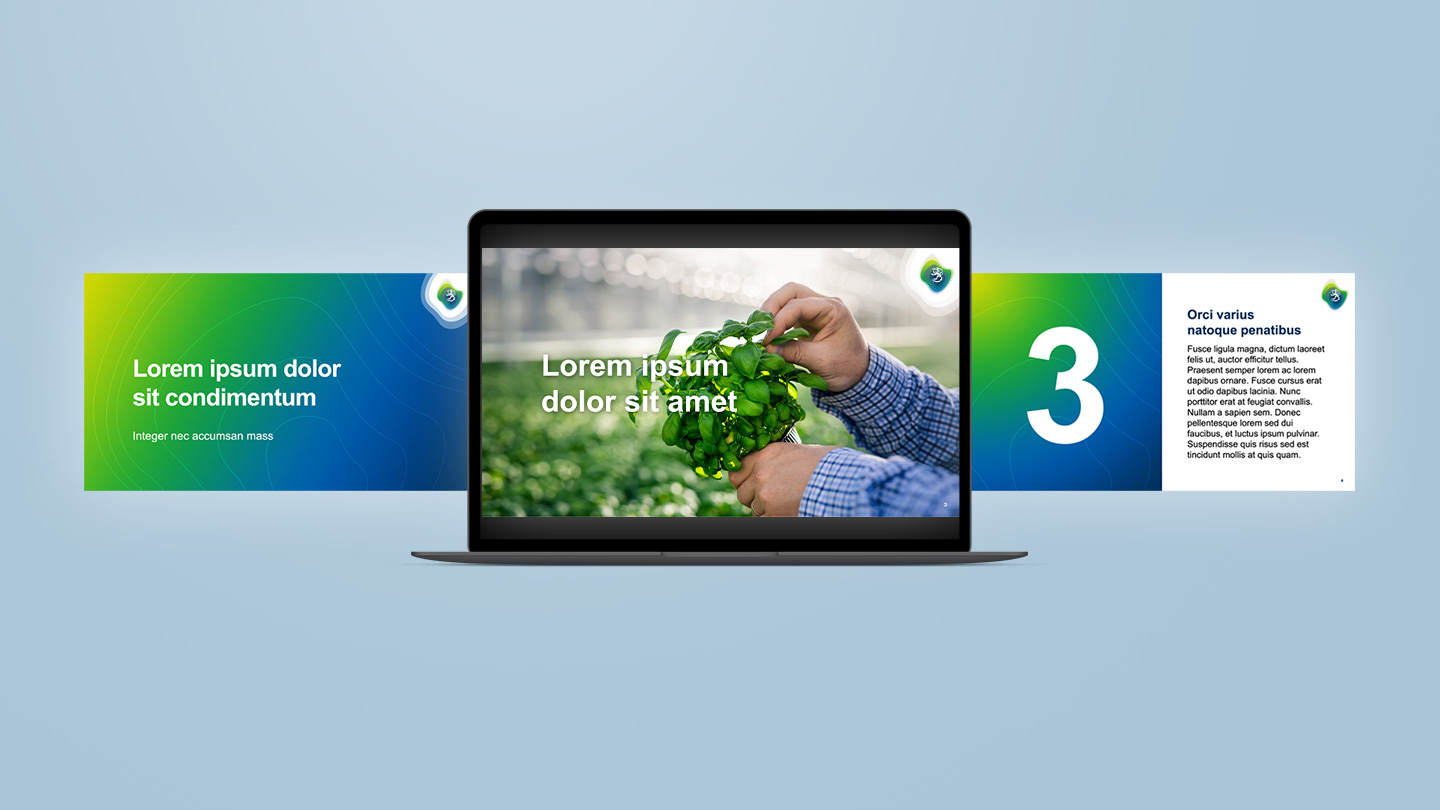
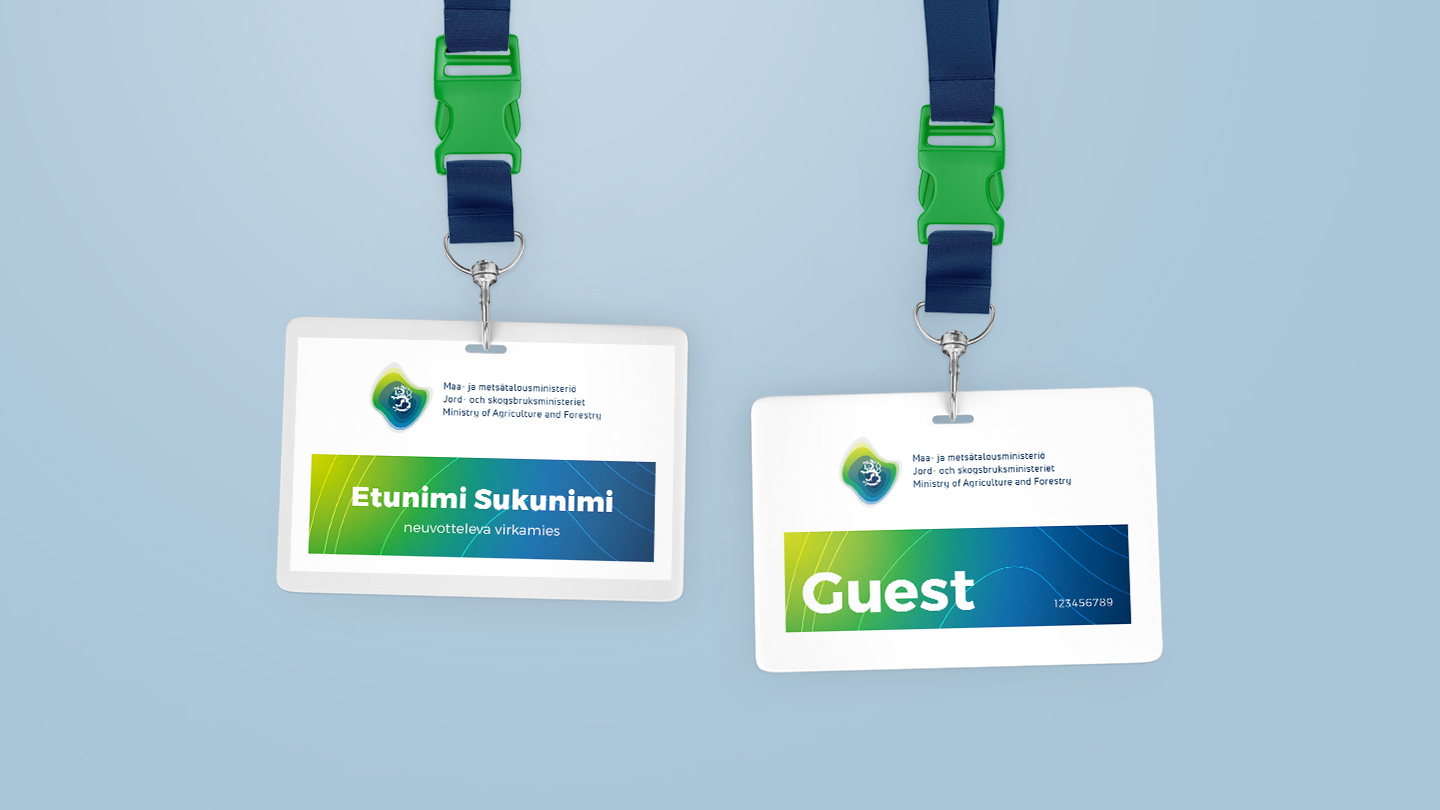
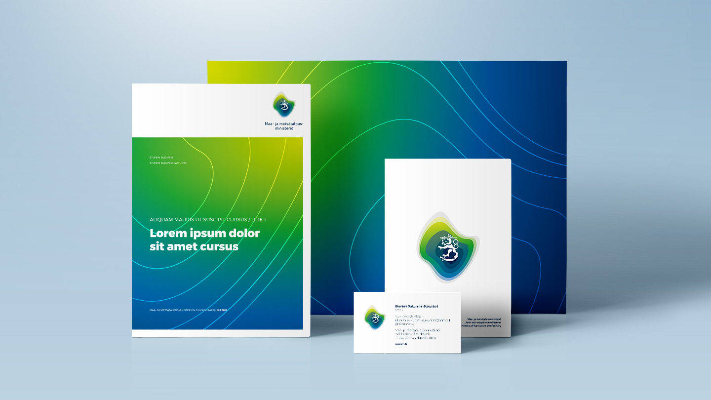
Drum designed a new look for the Finnish Ministry of Agriculture and Forestry that reflects the diversity of the ministry in a modern way. The Ministry’s logo and graphic look were renewed in the visual reform, and a brand video presenting the ministry’s versatile field of activity was created.


Starting point for the visual look

The logo and the new visual look were inspired by topography and ground surface shapes. The look can also be connected with the idea of different surface types and layering. The look and its applications also reflect the ministry’s diverse field of activity. The colours of the logo reflect the colours of Finnish forests, fields and lakes.

One of the starting points guiding the logo’s design process was the inclusion of the lion that unites all ministries.

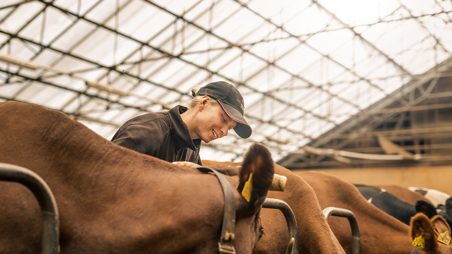
In connection with the visual renewal, the images the Ministry uses were also renewed: the images were intended to demonstrate how versatile the field of activity of the Ministry of Agriculture and Forestry is and how it affects people’s everyday lives.


The aim of the renewal was to make clear changes and break away from the previous visual look. We wanted to renew the visual image of the Ministry of Agriculture and Forestry to better correspond with the diversity of our operations. The new look has been received very positively both inside and outside the ministry.”

Janne Impiö, Communications Director, Ministry of Agriculture and Forestry

New images

Along with the visual look, also the ministry’s imagery was renewed. The images were to portrait how the ministry’s field of work effects people’s everyday lives.

Photography by Matti Immonen / Smak Film Oy www.smak.fi


Kristiina Heikkonen
Account Director
+358 44 050 6005

Read next

  • Brand

Drum designed a new, bold and fresh look for the Deaconess Foundation

  • Brand

Drum created a new brand for the listed company Efore

ENEDO — Brand

Drum created a new brand for the listed company Efore

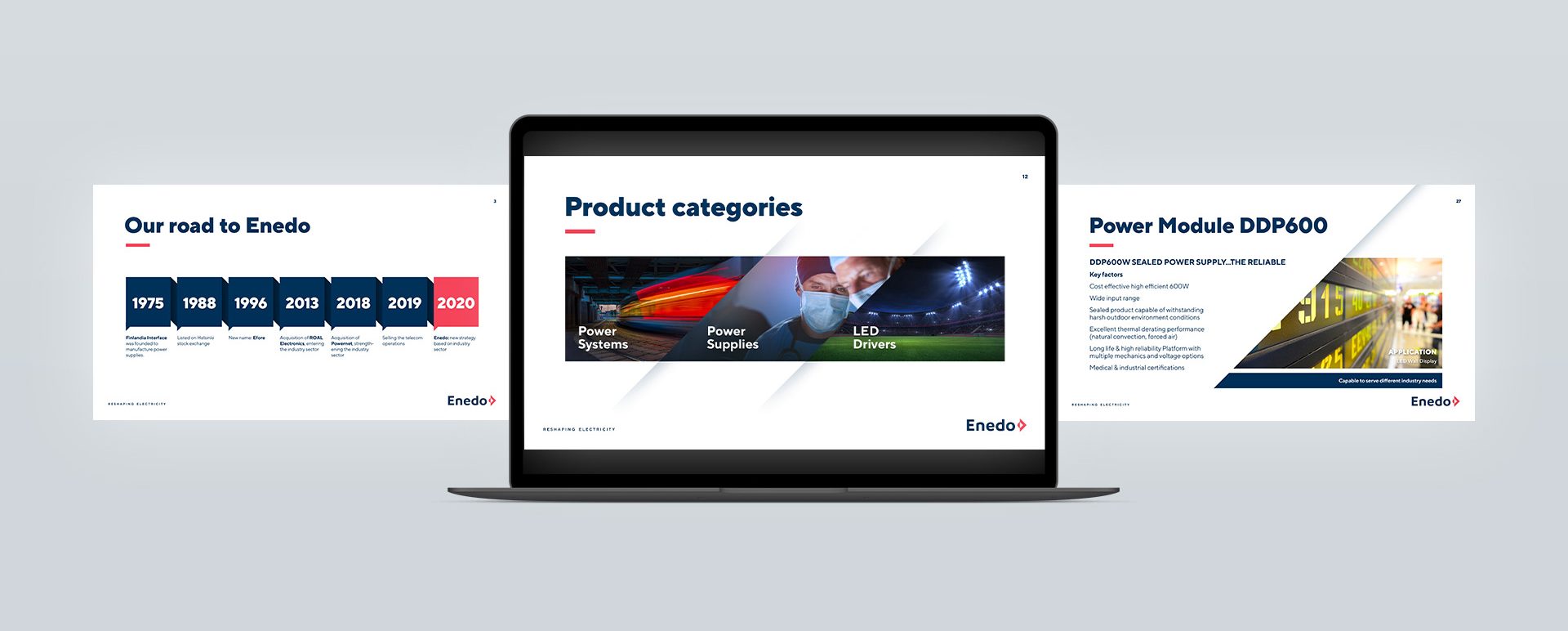
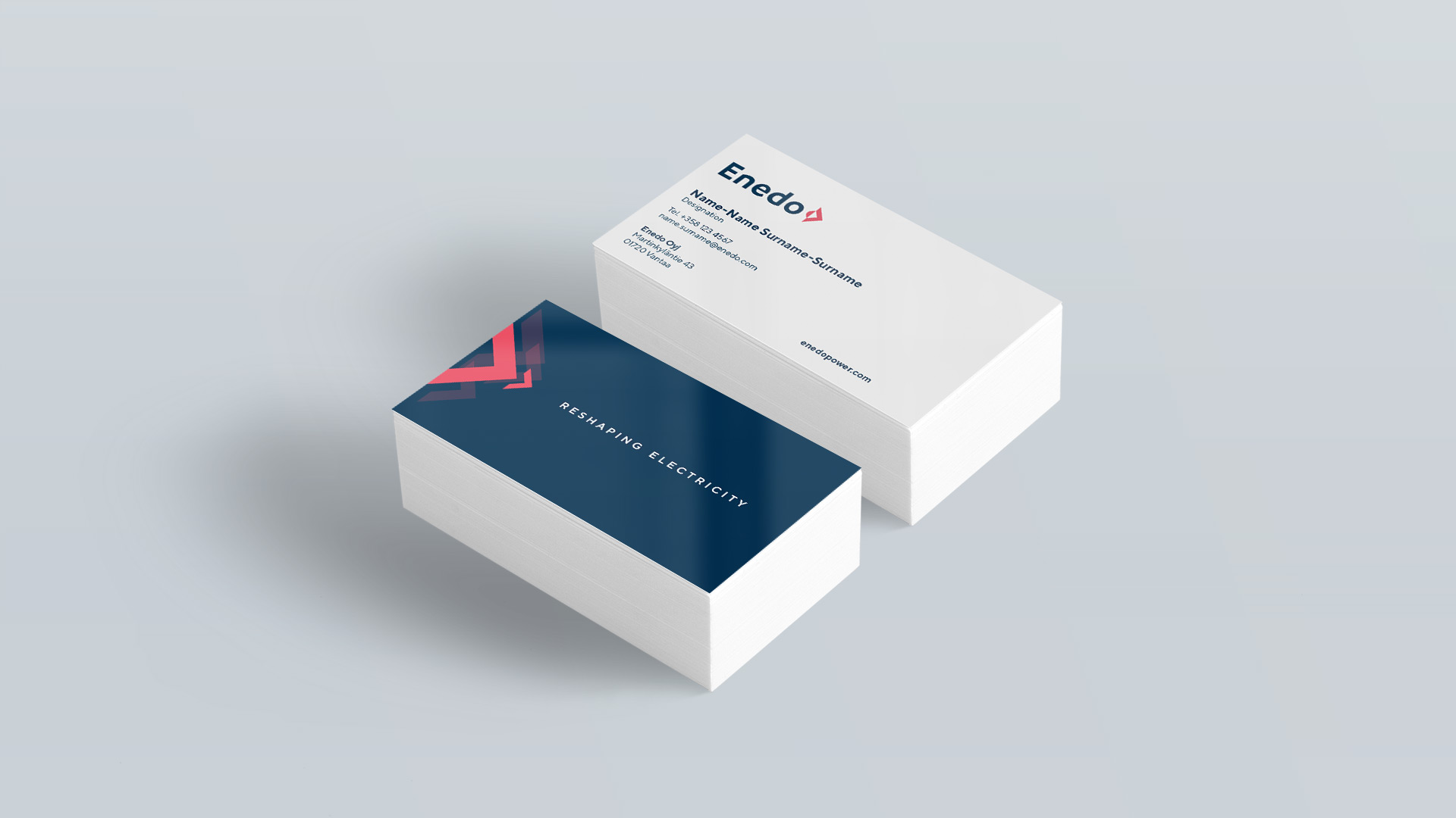
EnEnedo (formerly Efore) sold its telecommunications business last year. The transaction also included the company name and the entire brand. The focus of Enedo’s operations also changed: the company decided to focus on the design and manufacture of power electronics products and systems for the industrial sector. Enedo faced an acute need to renew its brand identity, story and visual look to make these reflect the company’s strategy.


Comprehensive preliminary study as the starting point

Drum’s team and the international management team of Efore started to work on the new brand in joint workshops. The objective was to get to the core of the multicultural company’s operations and highlight the brand’s strengths in relation to its competitors. Based on the workshops, a brand story encapsulating the company’s brand identity was created. The brand story is based on strong technological know-how, industry knowledge and Enedo’s products being suitable for even the most challenging environments.

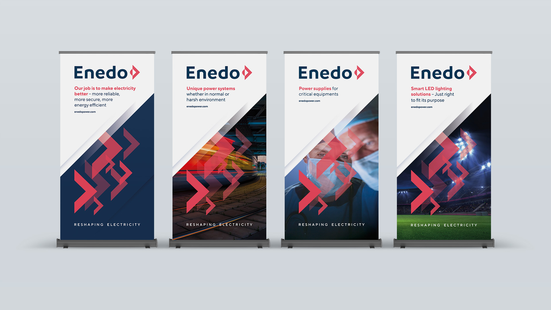
The slogan “Reshaping Electricity” and the tagline “Amps With Passion” were created in the same process, describing the operations of the company and its passion for action. The new name Enedo reflects energy and the spirit of getting things done. The new name had to work in all the required languages and it had to be possible to register the name in all of Enedo’s operating countries


Visual look based on brand identity

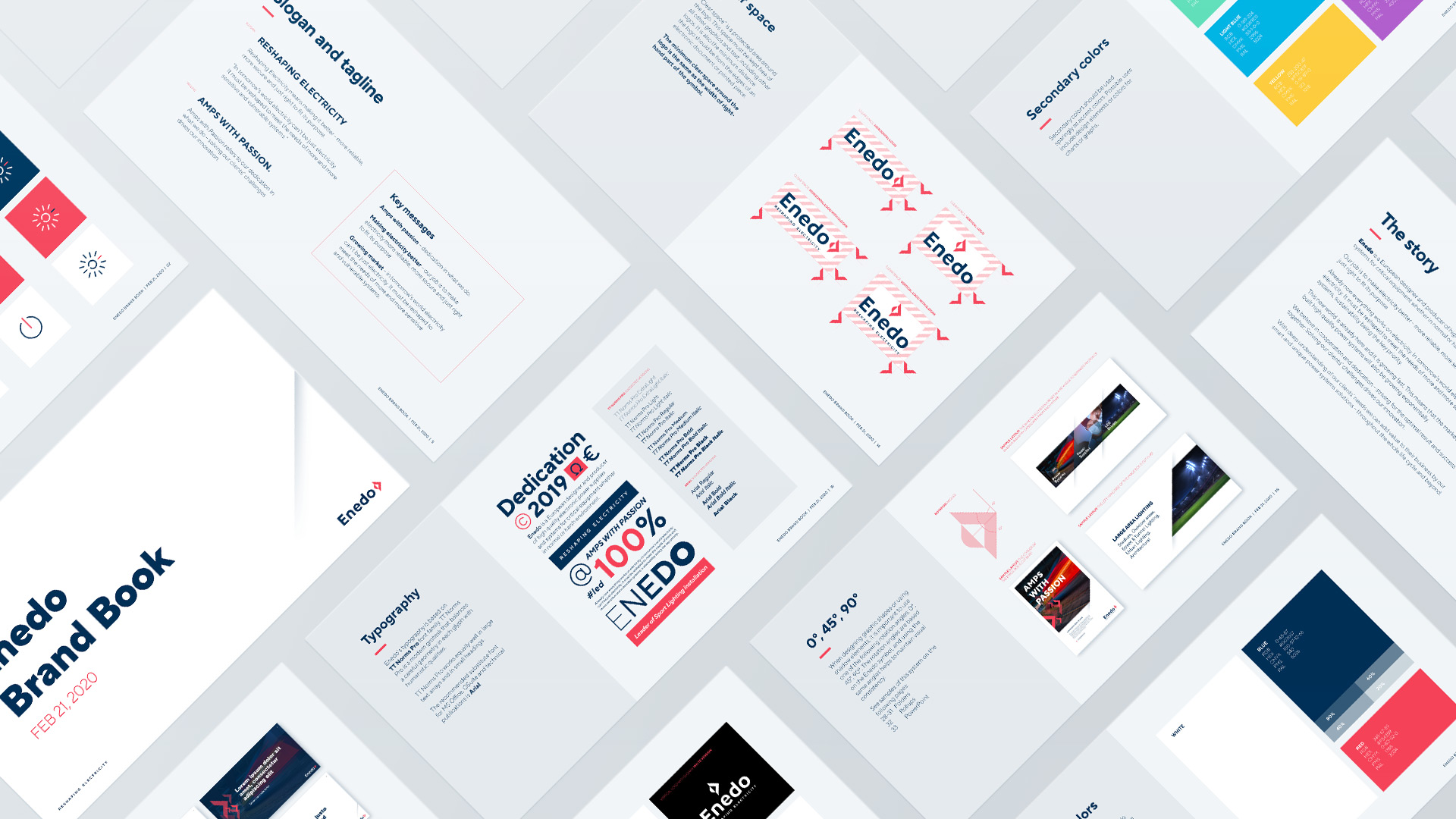
Enedo’s strong and recognisable look is based on its brand identity. Drum’s goal was to create a contemporary look for Enedo that would endure time and fit the company’s operating industry. The logo combines the idea of making electricity fit for its purpose with Enedo’s strong forward-looking can-do attitude.

Enedo’s brand work consisted of, for example, creating the brand identity and story, a new name, key messages for different target groups, a slogan and the definition of the company’s visual identity. Drum also compiled a brand book that contains a wide range of graphic instructions as well as examples of the application of the visual look.


For us, the new name and brand provide a great opportunity to start implementing our new strategy. The process lasted almost six months and was challenging, especially because we wanted to involve our staff from different business areas and countries in the design process. Our company, formed through a few acquisitions, is now more clearly the kind of Enedo that reflects what we want to be and achieve.”

Vesa Leino, CEO of Enedo Plc


Maija Tommila
Partner

Read next

  • Brand

Drum designed a new, bold and fresh look for the Deaconess Foundation

  • Brand

Drum renewed the look of the Ministry of Agriculture and Forestry

DEACONESS FOUNDATION — Brand

Drum designed a new, bold and fresh look for the Deaconess Foundation

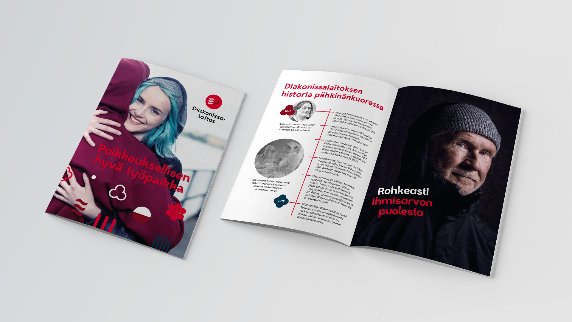
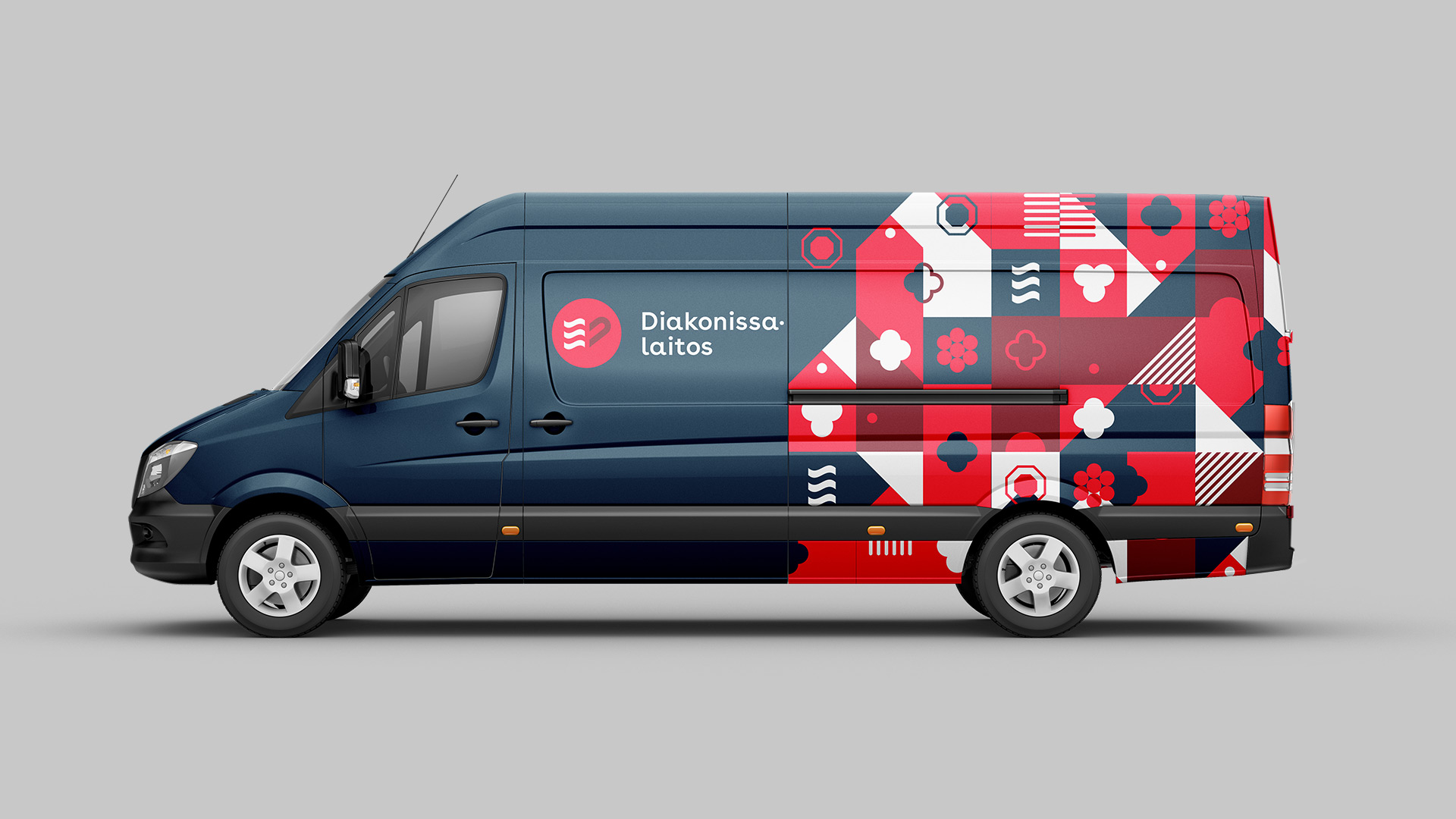
The Helsinki Deaconess Foundation changed its name to Deaconess Foundation and renewed its visual look at the same time. Drum’s work involved creating a new logo and renewing the foundation’s visual look. A modern and versatile design was also created, inspired by the old buildings in the Alppila quarter of the Deaconess Foundation.


Starting point

Drum began the visual renewal work by conducting a comprehensive preliminary study among the employees of the Deaconess Foundation. The study explored impressions about the Deaconess Foundation’s old visual look and mapped out ideas about the new visual look. The work continued in a joint workshop. The results showed that the Deaconess Foundation clearly wanted a more youthful look that would still respect the long history of the foundation.


The flaming heart took on a new form

The Deaconess Foundation’s wishes for a more playful and bolder look were taken into consideration during the design process. The reform also wanted to highlight the warmth, joy and caring that are important to the Deaconess Foundation’s brand. The Deaconess Foundation is a non-profit foundation that provides social welfare services and operates nationwide. It provides services to people who are at risk of being marginalised in our society.

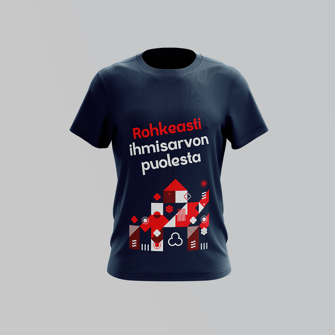
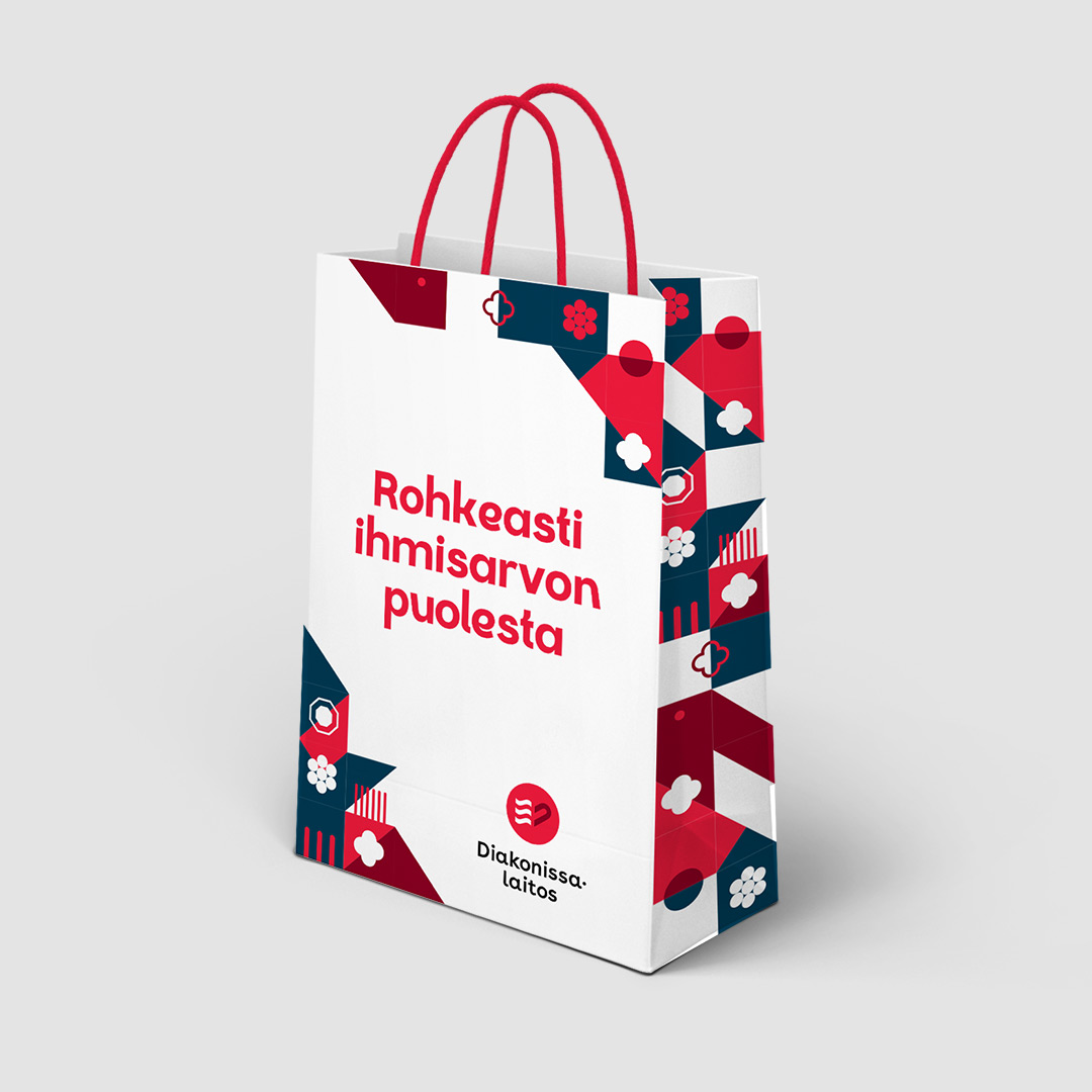
The result was a simple new logo that allows different interpretations. The logo depicts the flaming heart that was also included in the previous logo of the foundation. The brand images highlight the diverse target group of the Deaconess Foundation and include some touching details. To support the look, we also created a beautiful and modern design inspired by the old decorative patterns on the windows and walls of the buildings in the Deaconess Foundation quarter.


It was easy to work with Drum and the new visual look has been received very positively. I think the reform was a great success and we have received excellent feedback about the new look.”

Laura Niemi, Communications Director, Deaconess Foundation


Mari Kuusinen
Senior Communications Consultant
+358 40 196 4374

Read next

  • Brand

Drum created a new brand for the listed company Efore

  • Brand

Drum renewed the look of the Ministry of Agriculture and Forestry

Finnish Institute of Occupational Health – Campaign

The Mental Health Toolkit – Drum contributes to building a more humane working life

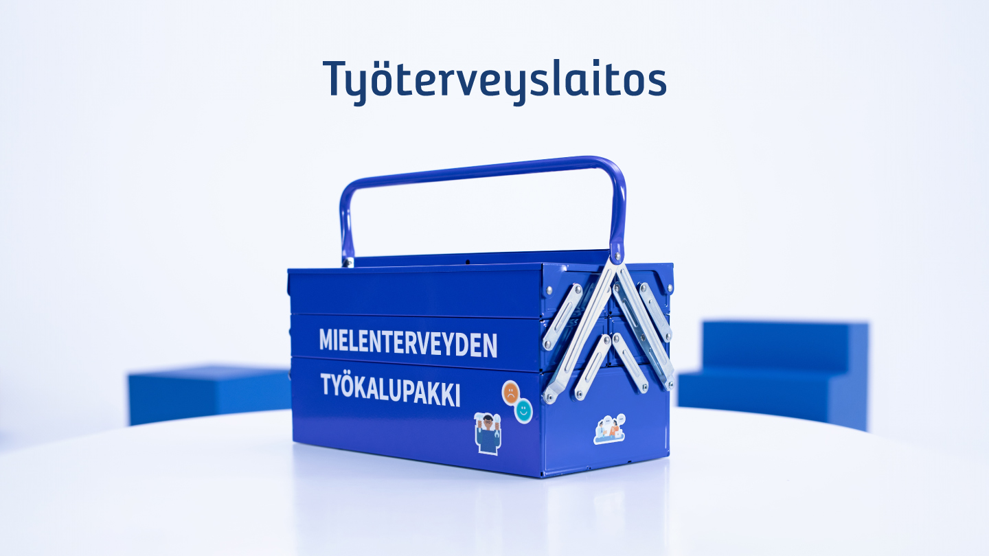
Finnish Institute of Occupational Health’s Mental Health Toolkit project provides workplaces with tools to improve well-being at work and promote a more humane working life. Drum’s task was to help the project communicate the overall message in a way that would encourage workplaces to pay more attention to the issue and to implement the tools offered by the toolkit. We designed and executed a concept that would make a complex topic concrete and appealing to target audiences.

Mental health problems are reflected in the workplaces

Sick leaves due to mental health problems are a major problem. Reducing them by half has been set as a target in the government programme. Mental health disorders are also the biggest cause of work disability, along with musculoskeletal disorders. Workplaces can not only promote mental health and prevent problems from arising, but also address them and take corrective measures. The lack of tools or policies in the workplace can be a hindrance. Mental health issues can also be perceived as challenging and difficult to approach.


Towards a more humane working life

The project aims to provide workplaces with tools to promote mental health at work. To this end, a toolkit has been created which can be freely used by workplaces and occupational health professionals. The project also aims to raise the profile of mental health issues in the workplace as a topic for discussion. Humanity at work and economic productivity often seem to be opposing goals, but this doesn’t have to be the case. Healthy employees produce better results.


Solutions are found in the toolbox

The work was initiated with the creation of a coherent and recognisable communication concept. Visualisation and concreteness were central to this: a physical mental health toolkit was designed as a project symbol, which has been used in all project communication. The branded toolkits are also used by the institute’s experts on client visits and at various events. The project’s complex web address was simplified to työkalupakki.fi.

In addition to mental health tools, the focus of the communication was on encounters: the institute’s experts and the support they provide to workplaces. The toolkit and its tools have been widely communicated through different channels. The communication has been carried out with messages targeted at different audiences and circumstances. Measures have included media communication, social media content, targeted advertising, webinars, user stories, various marketing materials and videos.


More than 1 500

workplaces reached

200 000

visitors to the website

7 työkalupakkia

Traveling around Finland

Drum has helped and sparred us in getting the content of a difficult topic across in a way that resonates with the target audience. They have helped with tool launches, designed and implemented various concepts and measures, and designed and produced numerous materials that have taken the visibility of the toolkit to the next level.”

Henna Laitio, Specialist, Finnish Institute of Occupational Health

Katri Pelli
Accont Director
+358 40 830 5372

Read next

  • Campaign — 
  • Employer branding

“I’m an Auditor” – A hot campaign raised awareness of the auditing industry among young people

  • Brand

Drum designed a new, bold and fresh look for the Deaconess Foundation

Search